Text Box Properties
Prerequisite Reading
Text boxes are containers for the text that will fit in them.
Adding Text Boxes
A video walk through of adding text boxes is available here.
- Find the text box icon in the tool menu, as highlighted below.
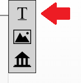
- Click and drag the text box icon onto the stage where you want to place the image.
- Drop the text box roughly where you wan to place it. Once you do, a box outline is presented. as highlighted below.
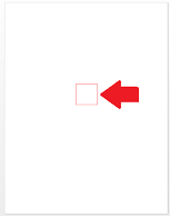
- When you see this, it means you can begin adjusting the text box's various properties.
Moving a Text Box
Click and drag the text box to its new position.
Resizing a Text Box
- Mouse over any of the sides of the text box.
- Once you see your cursor change to a 're-size' arrow

 , click and drag to change the dimensions of the box.
 - Once you stop dragging, the dimensions of your box have been changed.
Deleting a Text Box
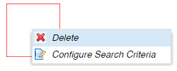
- Right-click on the text box
- Choose "Delete" from the menu, as shown below.
Text Box Properties
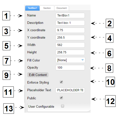
| # | Name | Description |
| 1 | Name | The name of the text box. |
| 2 | Description |
A description of the text box. Descriptions are not presented in the Wizard. However, if there are multiple people on your team configuring documents, filling out a description will help others understand the intent of your section(s). |
| 3 | X Coordinate |
The X position relative to the top left of the document Note: If you need precise control of x/y coordinates, you can enter a value here and see it reflected on the stage. |
| 4 | Y Coordinate | The Y position relative to the top left of the document. |
| 5 | Width |
The width of the selected text Box. Note: All dimensions are in points. 72 points to an Inch. |
| 6 | Height | The height of the selected text box. |
| 7 | Fill Color |
Fill or background color of the text box. The default value is "none" or no background. |
| 8 | Opacity |
The opacity of the text box. The default value is "100%". |
| 9 | Edit Content | Clicking this serves the same purpose as double clicking on the text box to edit its content. |
| 10 | Enforce Styling | When enabled, the configured paragraph style cannot be changed by a user in the Wizard. The Styles option shown in the screenshot becomes available on the top left of the ContentWelder Designer page when this option is enabled. Select the paragraph style that will be enforced for the text box from the Styles drop-down menu.
 |
| 11 | Placeholder Text |
This field allows Administrators and Designers to add placeholder text to a text box. This text will not be shown when the document is published. |
| 12 | Public |
See Shared Widgets for more information about the use of the "public" property. |
| 13 | User Configurable |
When enabled, users ordering this document are able to change the text. Enabling this property, additional options are made available as described below. |
User Configurable Properties
The following additional properties become available if "User Configurable" is enabled.
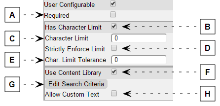
| # | Name | Description |
| A | Required |
When enabled, users that order this document must enter content into this text box in order to complete configuring this page. Note: If there is default text in the text box when users order they will be able to skip this text box as ContentWelder will interpret the default text as satisfying the 'required' property. |
| B | Has Character Limit |
Enable this property to restrict the length of the text the user can enter. Example If you have limited space on a postcard, while you do want to allow the user to enter their own content, you still want to ensure that it is visually appealing. Using this property allows you to limit the number of characters so that the final output is visually appealing. |
| C | Character Limit |
"Has Character Limit" must be enabled for this option to be used. If the value is greater than 0, ContentWelder will display a character counter informing the user of how many characters can still be added in the text box. |
| D | Strictly Enforce Limit |
"Has Character Limit" must be enabled for this option to be used. If enabled, as the user enters text during the ordering process, once the character limit is reached, the system prevents the users from adding any more characters. Note: Strictly Enforce Limit and Char Limit tolerance are mutually exclusive. |
| E | Char Limit Tolerance |
"Has Character Limit" must be enabled for this option to be used. If the value is greater than 0, when the user enters text during the ordering process, ContentWelder will allow the user to exceed the character limit by as many characters as is specified in this property. How is this useful? When dealing with character limits, due to the amount of space available on a document, it's important to remember that not all characters have the same width. i.e. the character "i" takes up less space than "w". doubly so with an upper case "W". By using the Char Limit Tolerance option, an Administrator can set a recommended limit and allow for a +/- range. |
| F | Use Content Library | Enabling this option will allow users to select text from the content library. |
| G | Edit Search Criteria |
"Has Character Limit" must be enabled for this option to be used. Allows you to restrict what content from the Content Library the user has access to in the Wizard ordering process. Example: By restricting access, you could ensure that only text that is relevant to the document's topic is available. i.e. not allowing someone to add content that is in the 'holiday' category if the subject of the document is about a loss in the family. |
| H | Allow Custom Text |
"Has Character Limit" must be enabled for this option to be used. If enabled, users will be able to enter custom content in addition to choosing from the content library. |
Text Does Not Fit Text Box
When text in a text box does not fit, a warning symbol  will appear in the text box. Increasing the size of the text box or removing some of the text within the text box will resolve this warning.

